GWTF
Go With the Flow

Go With the Flow is a fictional podcast design project. Each element was chosen and designed after careful consideration of who my target audience would be.
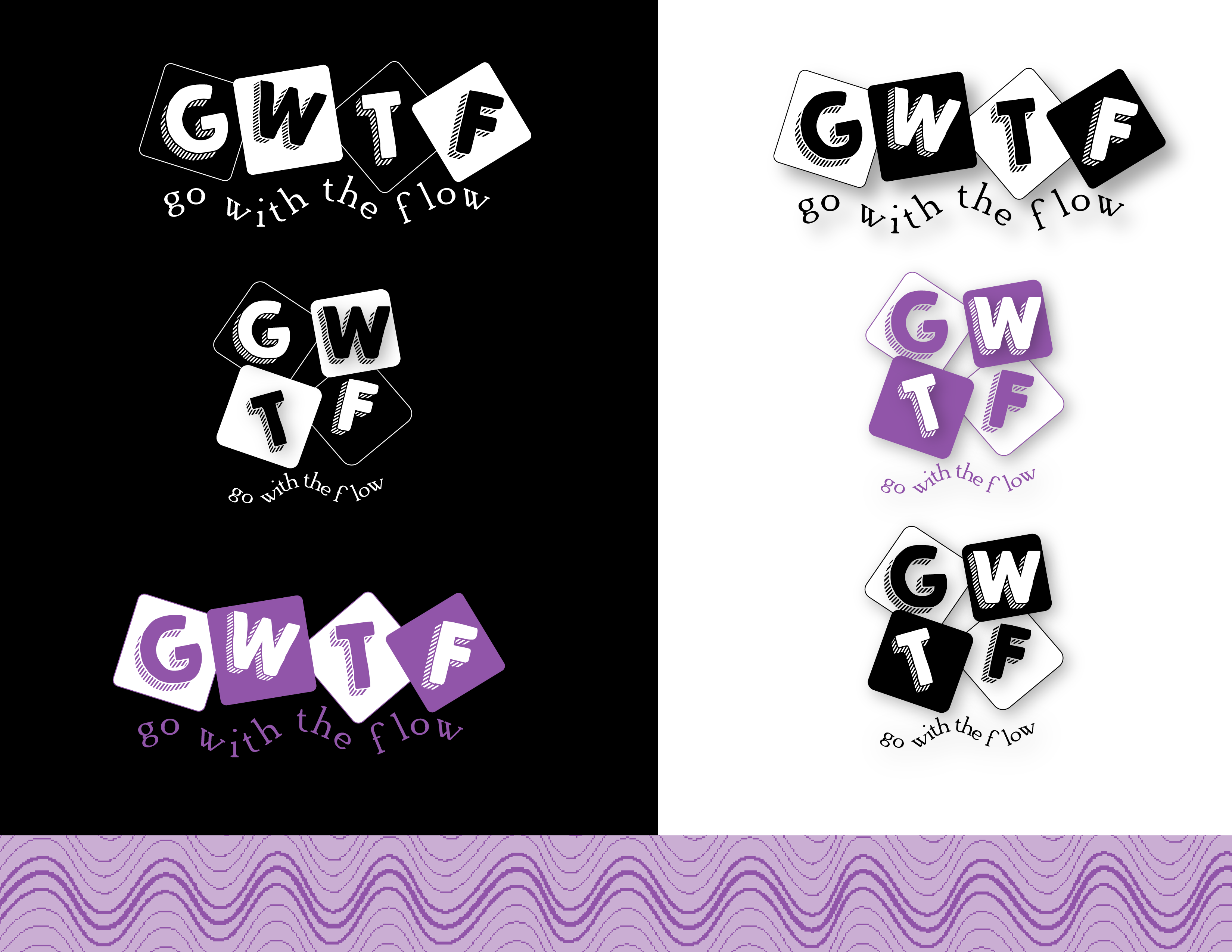
When designing a brand, one of the first steps is the logo. Colors, fonts and readability all came into consideration for this design. Any logo should look great in black & white before color is added in.
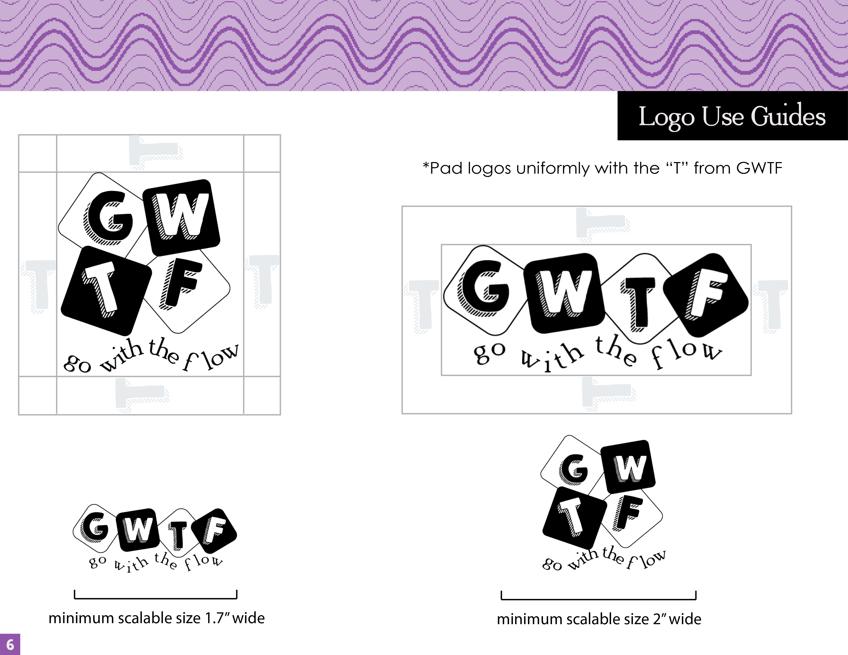
After designing the logo, I also had to clarify the parameters for using it. If it was sized wrong or crammed into a tight space it may not be as readable.
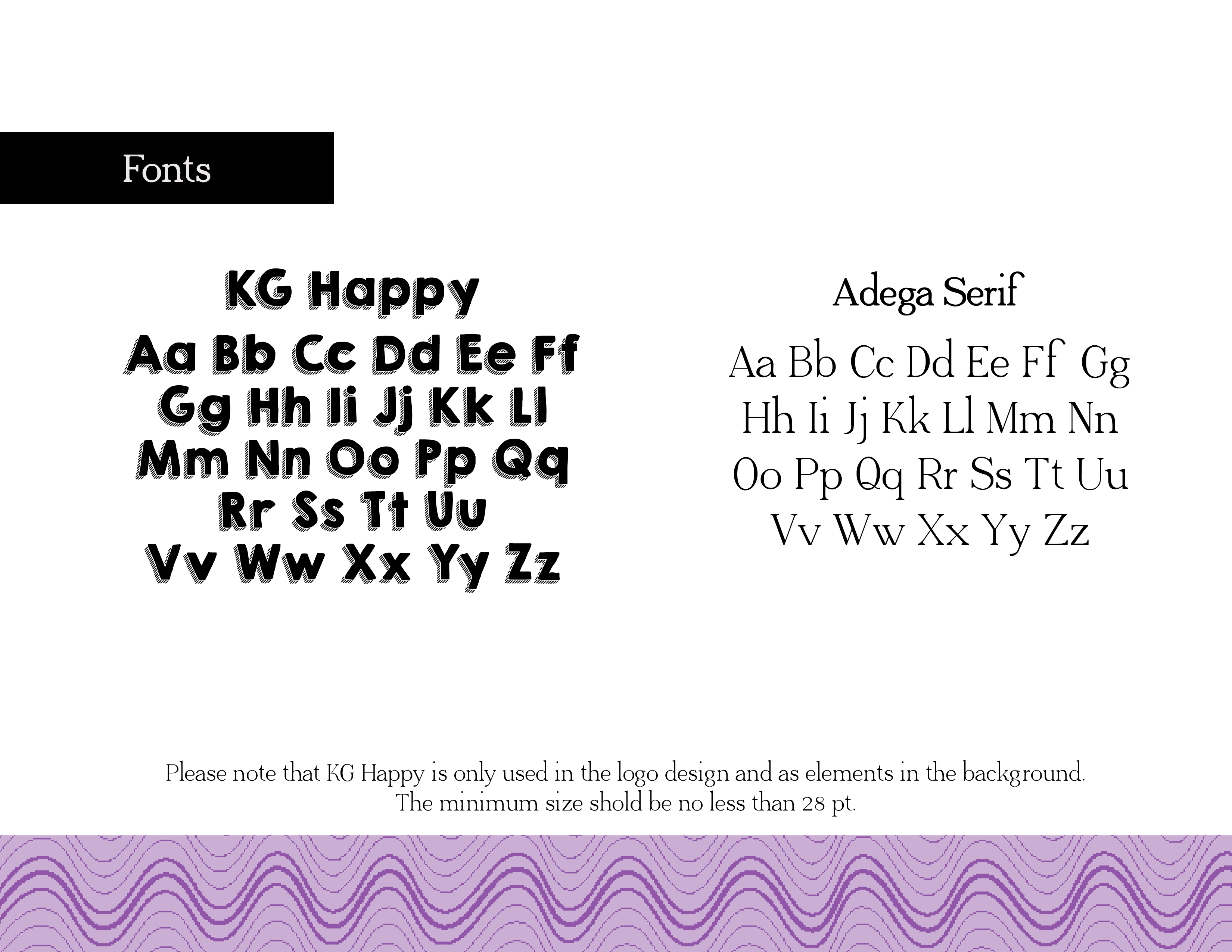
Choosing between the thousands of fonts available, I wanted something easy to read, yet fun. With a podcast, I only had so much time to grab the attention of a potential customer. Readability was key. Both of these fonts relayed the amusing feeling I desired and paired well.

Choosing the color for my brand was more about the emotion I wanted to invoke, rather than my likes and dislikes. I chose purple as a fun color for my subject matter and black because it was a dark time in the world. I used different tints and hues for a variety but stuck with the 2 major ones for my logo design. Adding in the lighter purple made it feel less "Halloweeny."
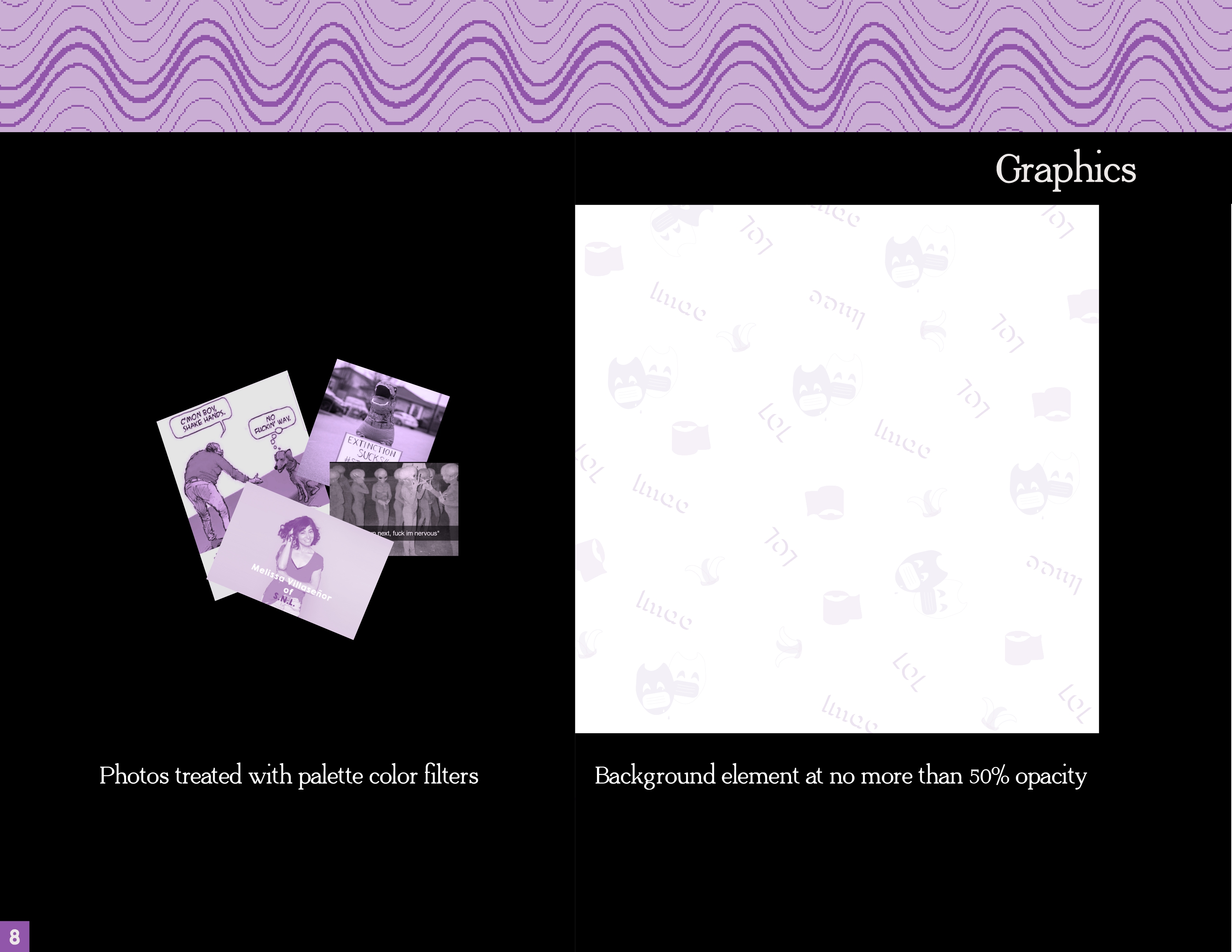
I added a photo filter on my website elements and to use in advertising my podcast. The jokes were all internet memes and easily fit in with the brand I was creating. Some of my illustrations were easily made into a background pattern to use wherever I needed to add a little color.
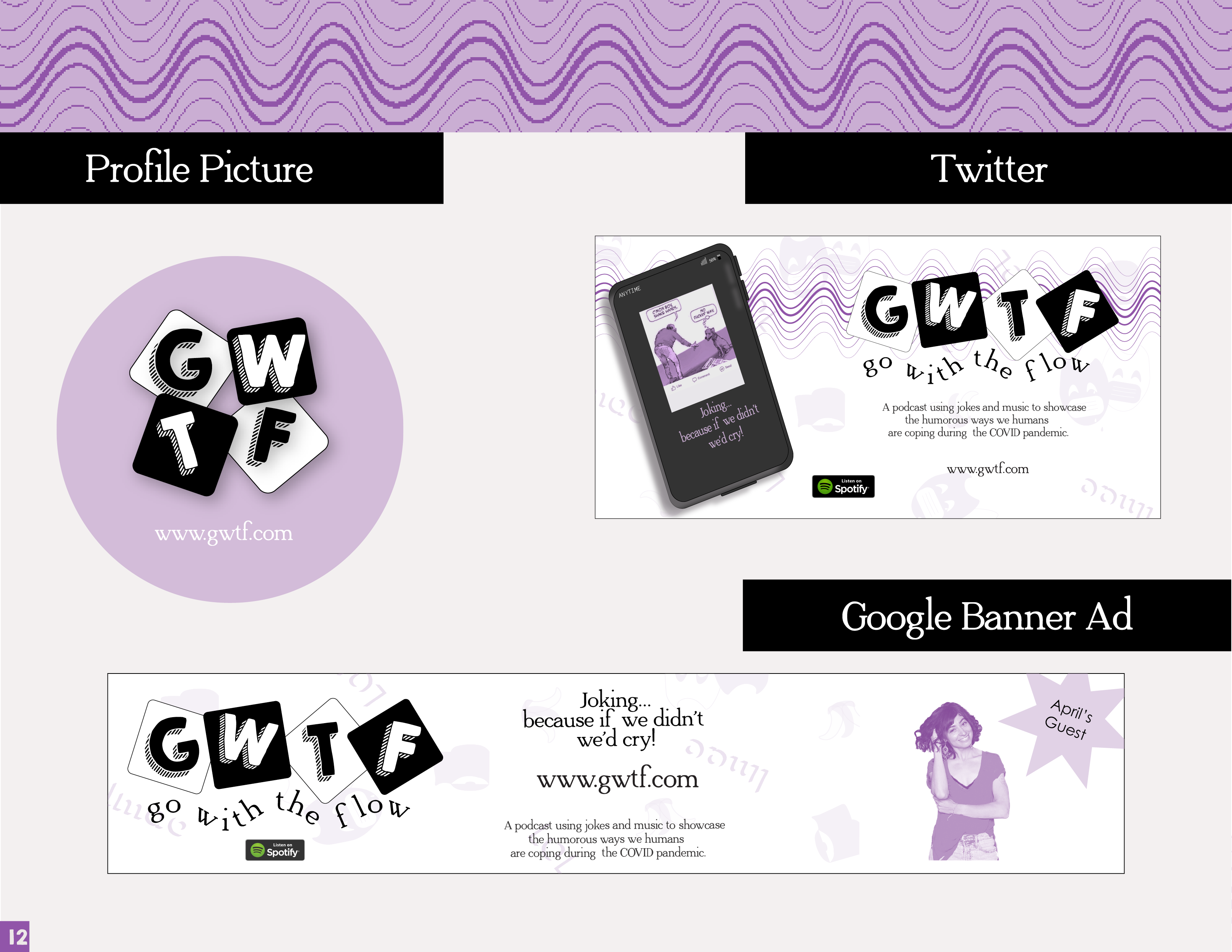
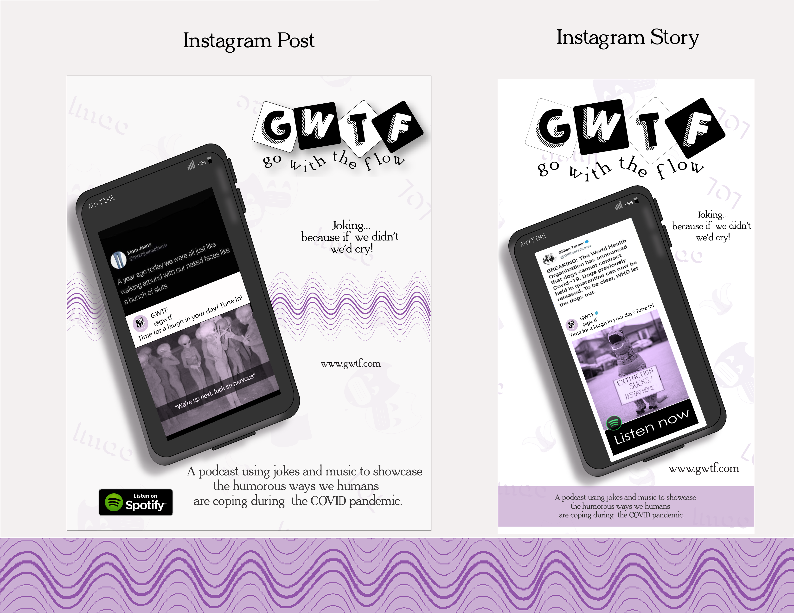
When designing the content for social media, keeping within my brand parameters was important. By creating a mockup of a cellphone, it allowed a user to see what my podcast was all about and that it was a portable media that could be heard on a mobile device.
The elements all came together to create ads for different social spaces. Setting the parameters for use made them easy to adapt for various sizes.
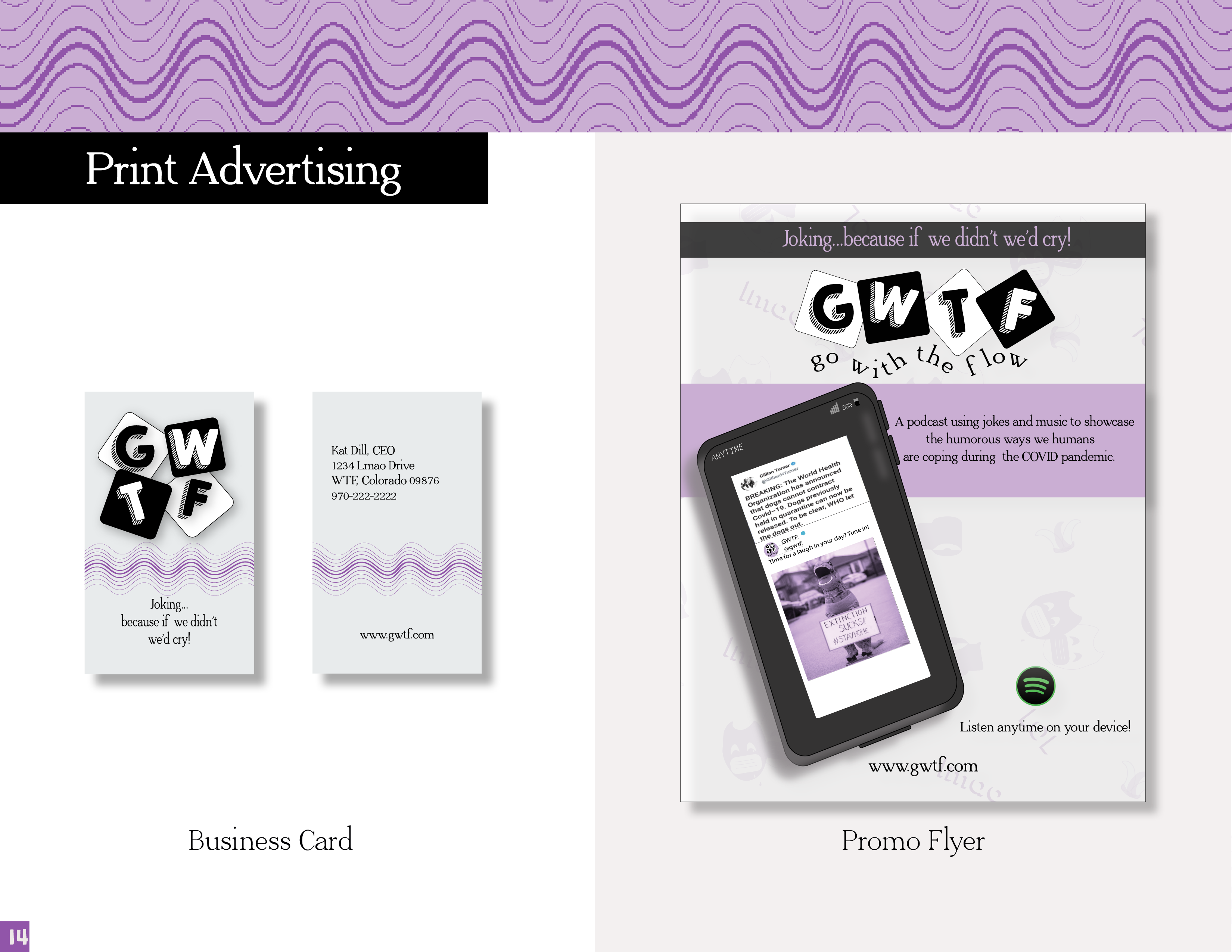
Creating print collateral is an important part of branding. Having something as simple as a business card and flyer makes my podcast memorable. A piece of paper provides sensory stimulation and serves as a reminder to my potential audience, advertisers, and investors.
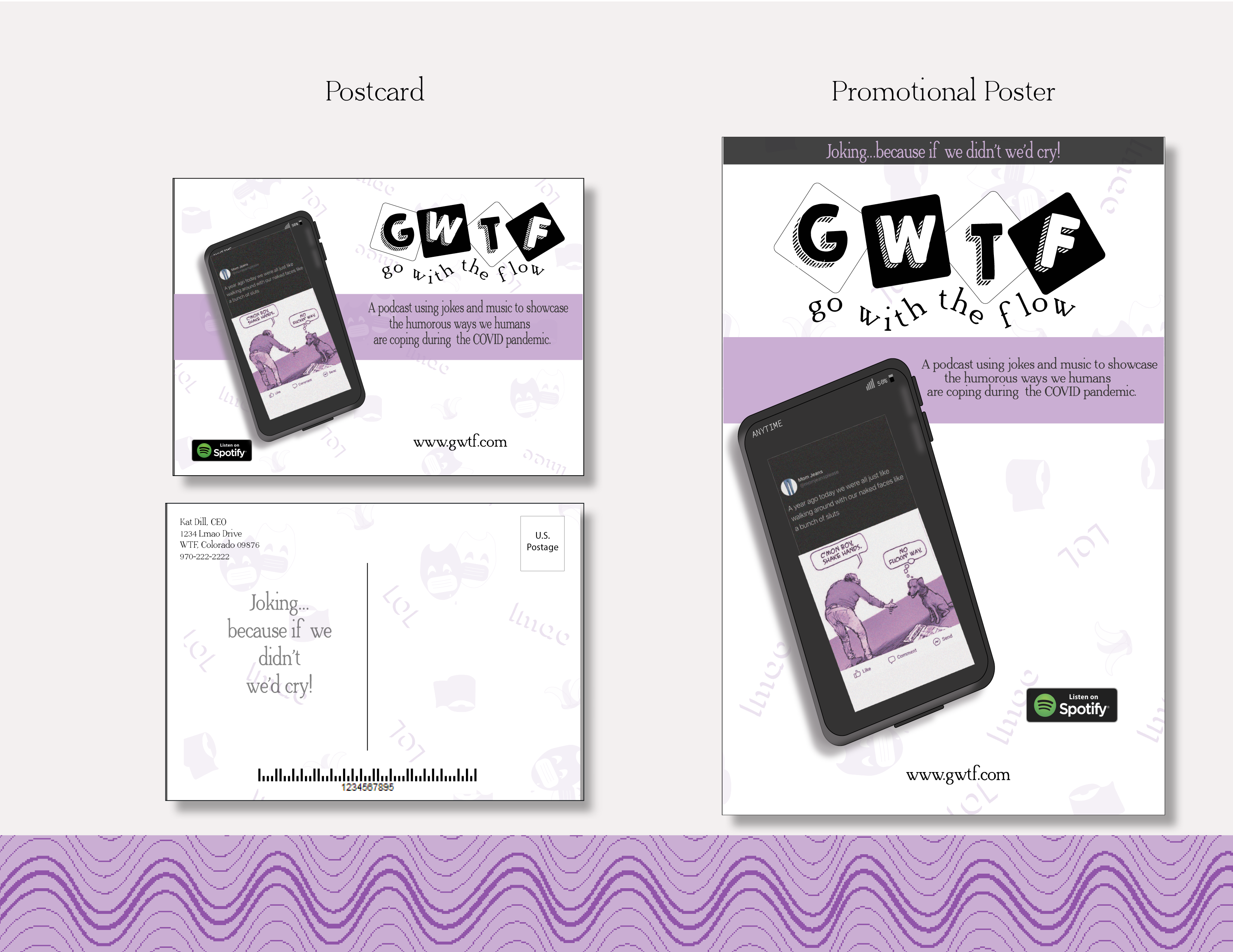
Postcards and promotional posters provide that same stimulation. Postcards can be sent to current listeners or target audiences while posters can be hung wherever my audience can be found.
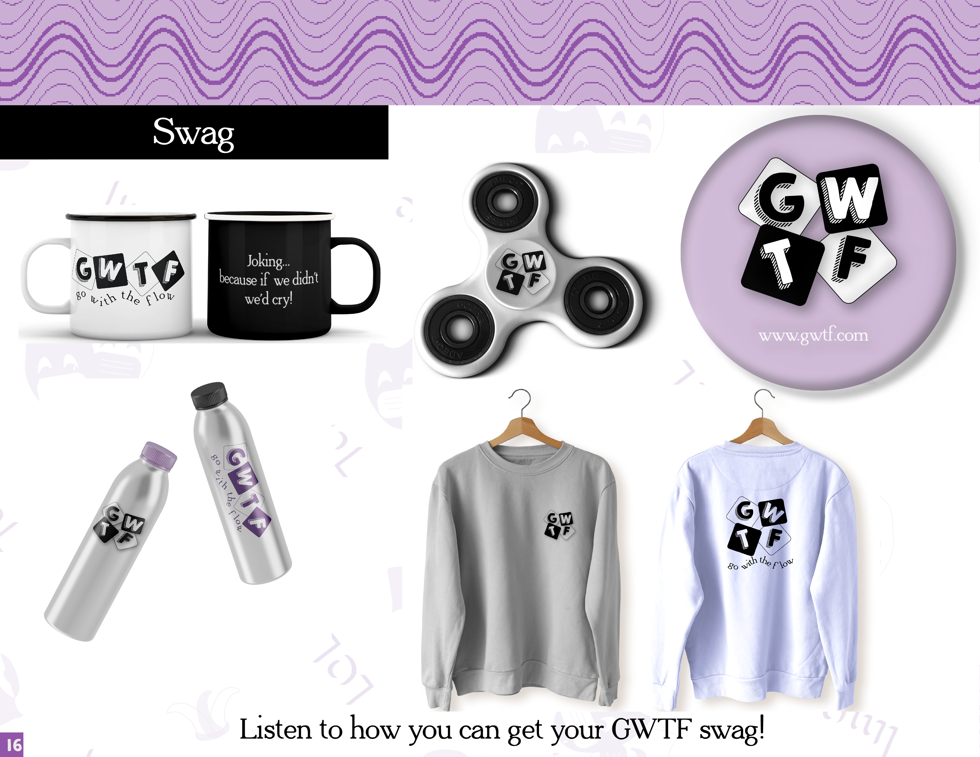
Swag is like advertising, not free but can be inexpensively made and sold or given as a prize. Items such as apparel, stickers and drinkware can provide exposure to my brand for a long time.
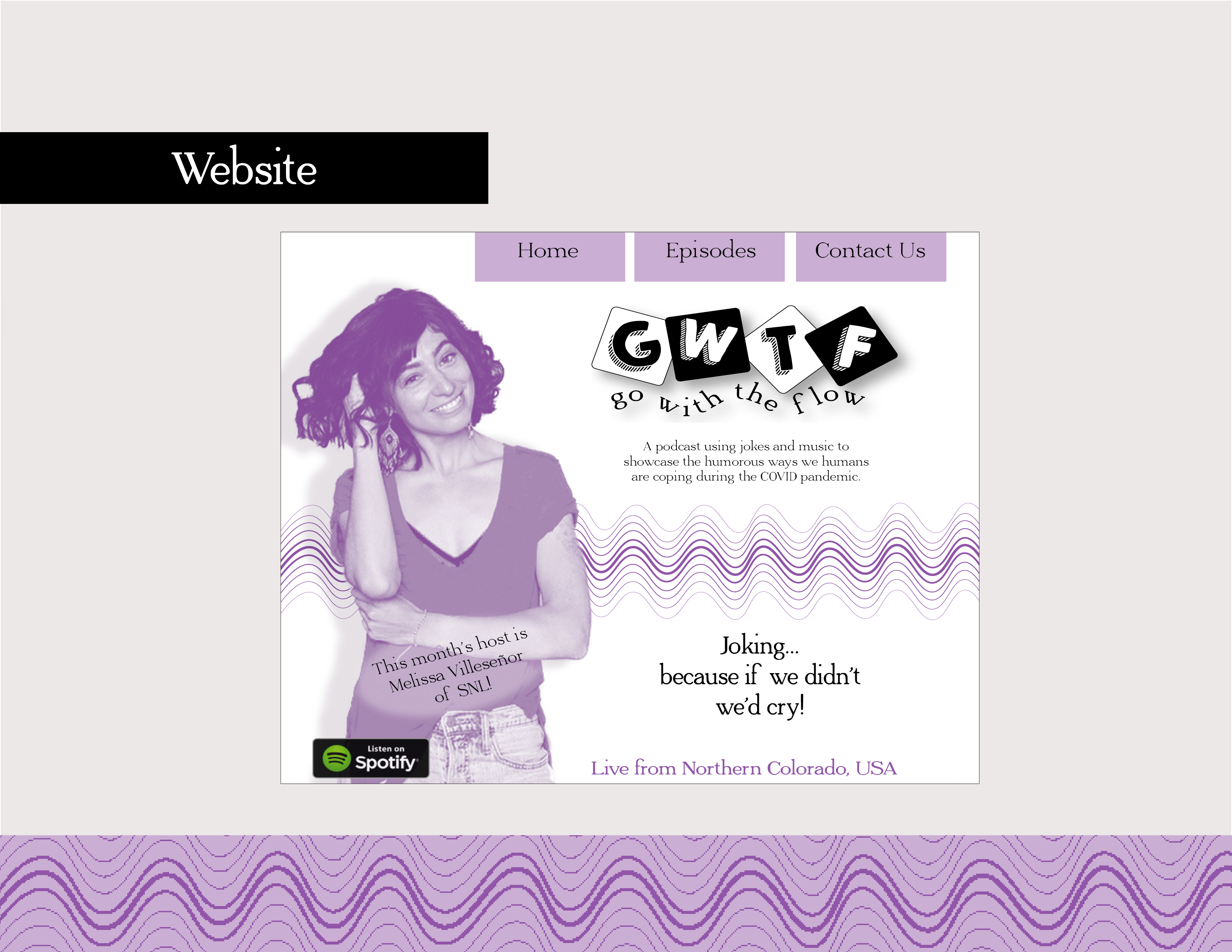
GWTF needed a website so I designed a simple landing page. A simple website was a good place to start and can be added to with e-commerce plug-ins if I choose to sell my swag.
I designed this animation for Twitter using different brand elements. Videos on Twitter stand out more and is a potent way to increase my reach, as well as brand awareness.
